| Detail from Panel 1 of Chapter 1 - 2010
The Making of
Chapter 1
Against the Odds
T
he first big challenge I was faced with when I started to work on Chapter 1 of the Worm- world Saga Digital Graphic Novel was that I actually didn't have the time to do it. I was working an 8.5 hours job and my commute took another 1.5 hours out of my day. Given the fact that my wife liked to talk
to me for at least a few minutes when I came home, I pretty soon realized that I had about two hours each day that I could invest into the project. A project that was going to cost me presumably hundreds of hours.The only thing that makes something like this work is discipline. I got one of these schedules that teachers use to organize their lesson plans, and I marked my job and the commute with red/orange. Hours for eating and housework became yellow, private time was marked in light pink and sleeping time in light blue. The precious Wormworld Saga time was marked in green. That way I got a clear picture of the time that was at my disposal, and it really helped me focus when those hours of the day arrived. I accompanied the schedule with a little software that counted my work time, and that helped me to confirm that I was really working 10 hours every week on the Wormworld Saga.
If you take into account that the year has roughly 50 weeks (I subtract a minimum of 2 weeks for vacation and/or illness) then we are talking about 500 hours a year at your hands. And that is definitely enough time to get some stuff done. The only trick is to really look at it that way.
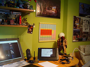
| The schedule at the heart of my studio
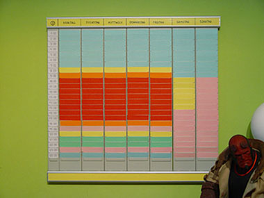
| Close-up of the schedule
Setting things up
Before I could start work on the first chapter, I had to set up rules. I had never done something like the Wormworld Saga Digital Graphic Novel before, and there were a lot of questions to answer. The first was in which size I should
be working. I had decided to display the graphic novel in 1024 pixel width. My reasoning behind that was that I wanted the comic to
be readable on practically every computer screen that was out there and I took into account that netbook screens were a lot smaller
than the average desktop screen. A few months after I had started with the first chapter, the Apple iPad was announced and I was delighted
to find out that it was going to have a screen that was 1024 pixels wide. So, I knew my target resolution but in which size should I
actually draw? To decide this I created two images, one in double resolution and one in triple resolution, and compared both to each other.
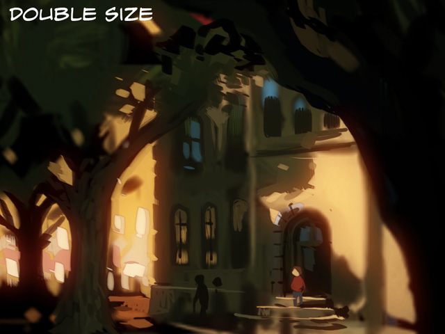
| Resolution test in double size scaled down to the actual target size of 640px width
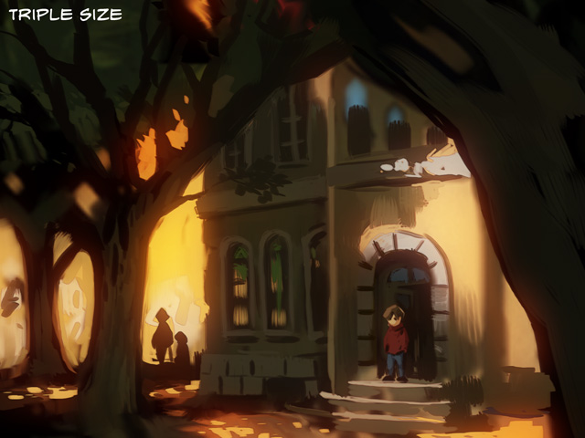
| Resolution test in triple size scaled down to the actual target size of 640px width
The difference might be subtle to the untrained eye but in the second version I liked the crisper detail and the finer lines the higher
resolution produced. That meant, that I would produce the artwork for the graphic Novel in 3072px width. However, most of the panels
of the first chapter were actually
created in 1920px width because I assigned a central column that is 640 pixels wide in which most of
the panels would be placed. That way I was able to keep dialog panels in the central column and combine them with full width panorama panels
that would break up the layout.

| First layout test. The total width of the layout is 1024 pixels, the central column is 640 pixels wide.
After I had decided in which size I would be working I had to come up with a workflow to create the graphic novel. I had already started to lay out the
story of the first couple of chapters with sticky notes on my "story wall". My general workflow on the story wall was to put the major
plot points on individual
notes and develop the story by rearranging them. It is a handy way to insert new plot points or to change existing ones (especially after I had changed
the arrangement of the notes of an individual chapter from horizontal to vertical).

| The "story wall". I later changed the layout of the individual chapters from horizontal to vertical.
My next step might have been to create a script, but I wanted to jump right into the action and instead of a script I created a preliminary
version or 'prelim' of the chapter in greyscales. This prelim also contained the dialog and worked better for me than a script because I could
get closer to the end result but I was still able to make quick changes to
the pacing of the story. To fine tune the prelim, I would read it again
and again and I would insert, delete, and scale individual panels until the story worked for me. I went through several versions of the prelim
until I decided that I was ready to start working on the final artwork of Chapter 1.
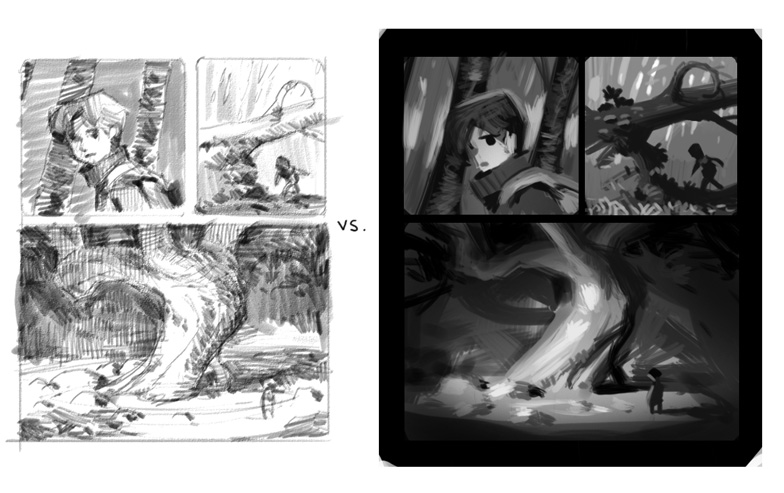
| Two options for the look of the preliminary version. I ultimately chose the right one because it communicates the effect of light and the shapes of the scene more clearly.
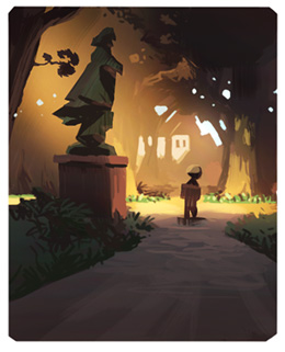
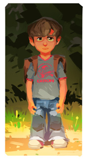

| Early style tests to define the look and feel of the final artwork
Defining the Visual Style
The first thing that comes to mind when you hear the term 'comic' is inks over pencils. My general feeling is that
inks over pencils tends to interfere with the modeling of light and shade. I wanted to make the rendition of atmospheric
light a central element of the Wormworld Saga. In my mind the story looked more like a movie than a classic comic
book.
So I basically knew right from the beginning that I wanted a painted style for the Wormworld Saga. All illustrations I did for the story over the years had been paintings, although they differed in style. In 'The Journey Begins' I used muted colors and very fine detail. 'Trapped!' featured a more colorful palette and stylized detail. Although quite different in style, both artworks show tightly rendered detail. During 2008 and 2009 I started to loosen my painting style up a bit. I used more painterly brushstrokes and started to hint at detail rather than rendering it. My artwork 'Sea Temple' is a nice example of this approach, and it came very close to what I imagined the Wormworld Saga would look and feel like.
So I basically knew right from the beginning that I wanted a painted style for the Wormworld Saga. All illustrations I did for the story over the years had been paintings, although they differed in style. In 'The Journey Begins' I used muted colors and very fine detail. 'Trapped!' featured a more colorful palette and stylized detail. Although quite different in style, both artworks show tightly rendered detail. During 2008 and 2009 I started to loosen my painting style up a bit. I used more painterly brushstrokes and started to hint at detail rather than rendering it. My artwork 'Sea Temple' is a nice example of this approach, and it came very close to what I imagined the Wormworld Saga would look and feel like.
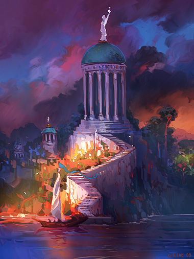
| 'Sea Temple' - 2009
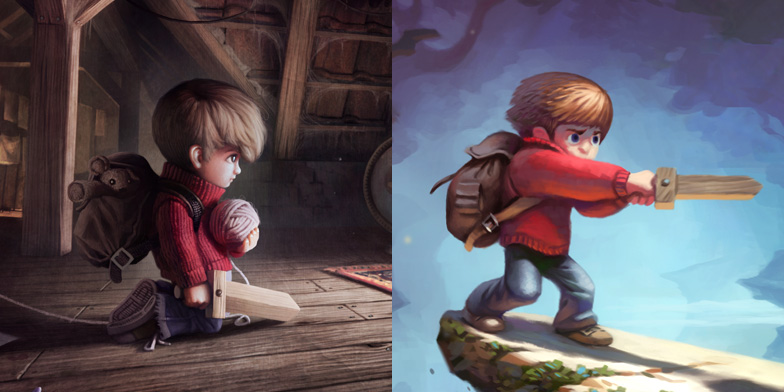
| Details from 'The Journey Begins' and 'Trapped!' that show different stylistic approaches
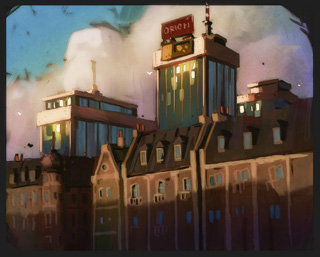
| Another style test
When I started to create the final artwork, things didn't go too smoothly. It was an enormous struggle for me to land at exactly
the style that I imagined. The problem got especially complicated since I had to paint things that I had never really painted
before: cars, park benches, highways, etc.
I felt confident when I was painting trees or nature scenes in general but before I was able to paint a Volkswagen the right way, it really took me some time, and I had to abandon quite a lof of work. And since I was working on a tight schedule, every artwork I had to abandon really hurt.
I felt confident when I was painting trees or nature scenes in general but before I was able to paint a Volkswagen the right way, it really took me some time, and I had to abandon quite a lof of work. And since I was working on a tight schedule, every artwork I had to abandon really hurt.
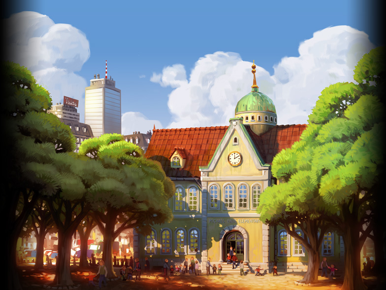
| Abandoned version of the opening shot with the schoolbuilding
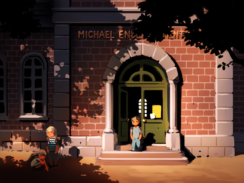
| Abandoned work in progress of Panel 9
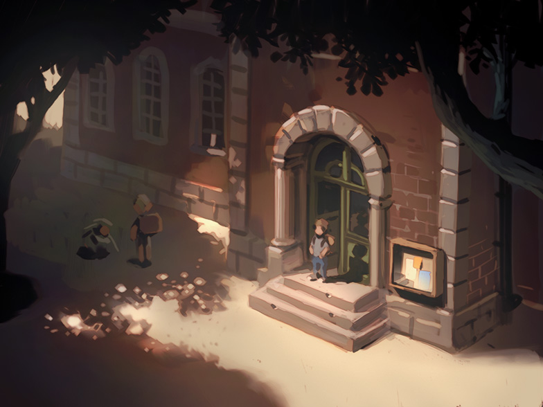
| Another abandoned work in progress of Panel 9, but getting closer...
After having painted the opening of Chapter 1 several times, I slowly found the right balance between expressive brushwork
and rendered detail. A style in which I could depict the organic chaos of treetops and the hard edged shapes of automobiles. However,
I still consider the first chapter to be a huge testing ground, and there are definitely panels
in it that I would have liked to rework.
At some point I had to let go of my perfectionism and accept the fact that sometimes you have to take compromises in order to go on. After all,
the general look and feel of the first chapter comes very close to what I had in mind.
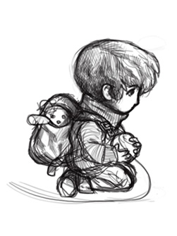
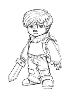
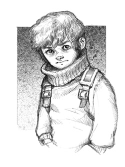
| Different visions of Jonas that emerged over the years
Character Design
My biggest challenge concerning the character design was to create a final version of Jonas. This character existed in my head
for over half a decade and he took on very different shapes over the years. I wanted to get a clear image of this character
in my head, and therefore started to create a digital sculpture of Jonas. The advantage of a sculpture over a drawing is that you
get to know every single angle of the character. When I started to bring the sculpture into pose and applied different facial
expressions to it, Jonas really came to life for me. However, I did not stick slavishly to this sculpture when I started to paint
Jonas in the graphic novel. But the whole process gave we a very good direction and from that point I was able to evolve the character
further to the point that you see in the first chapter.
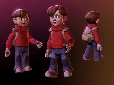
| Digital sculpture of Jonas

| Digital bust of Jonas from different perspectives. This helped me to get a clear understanding of his features
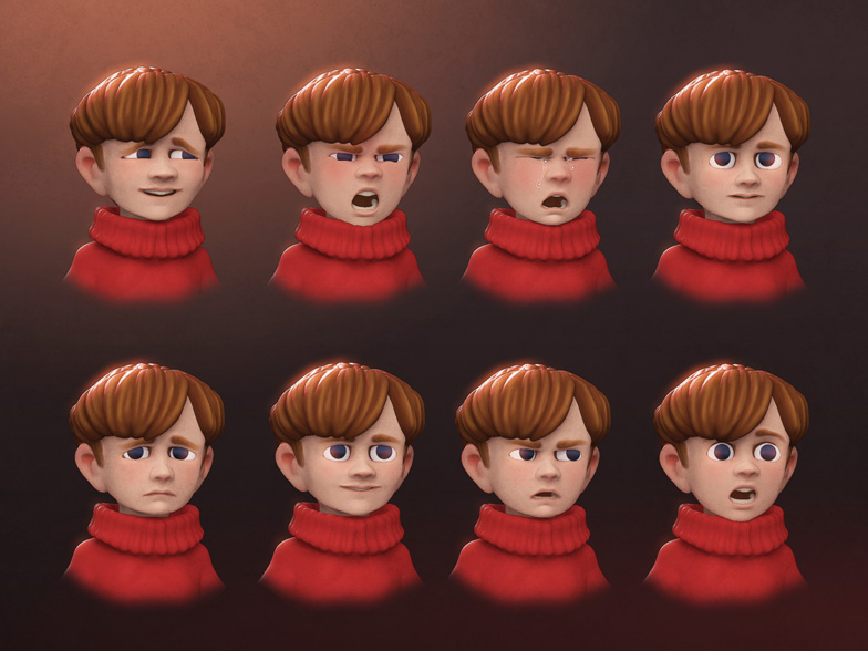
| I toyed around with different facial expressions. Here, Jonas truely came to life for me
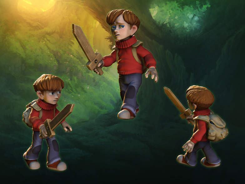
| Jonas in full adventure gear. I really had a lot of fun with the digital sculpture
I wish I had been able to put so much effort into every character design of the first chapter. The truth is that all other characters
were more or less designed on the fly. For most of the characters that was perfectly okay, because we see them in only a couple of panels.
If there's one character design that I wished I'd more time to work on, it's Jonas' father. He's seen from different angles in the first chapter and I had the feeling that I hadn't understood his features quite as good as Jonas'. I had created only a few sketches of him before I worked on the panels that feature him. The second chapter fortunately will give me the opportunity to elaborate on this character.
Jonas' grandmother was also designed on the fly but in her case I'm actually quite happy with the result. She's this type of character I instantly got a picture of in my head. Sometimes you should just grab the first idea that comes to your mind and run with it.
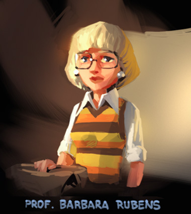
| Color Sketch of Jonas' class teacher
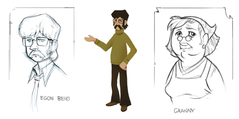
| Some of the very few character sketches that exist of Egon Berg and Granny.
Step by Step to the Goal
The creation of the first chapter of the Wormworld Saga Digital Graphic Novel was a very intense experience for me. When I started the
project, the amount of work seemed to be just impossible to accomplish because of my day job. During the first weeks I got really
nervous because I had no idea how much time it would take me to finish the whole chapter and I had to throw away a lot of failed artwork
which cost additional time. After I had finished the first 20% of the chapter (simply measured by height) I started to calm down a bit.
I called that point my first milestone and set up 5 more milestones at each 20%. That way I created small goals which I actually was able to
reach in a manageable timeframe, one by one.
When I finished the first chapter on November 9th, 2010, I had worked 230 hours on it. The first chapter is 26,000 pixels high in its reduced target resolution and 78,000 pixels in its original size. It was published on the wormworldsaga.com website on December 25th, 2010 and in the first nine months after its launch, it received over 750.000 hits from 192 countries.
When I finished the first chapter on November 9th, 2010, I had worked 230 hours on it. The first chapter is 26,000 pixels high in its reduced target resolution and 78,000 pixels in its original size. It was published on the wormworldsaga.com website on December 25th, 2010 and in the first nine months after its launch, it received over 750.000 hits from 192 countries.
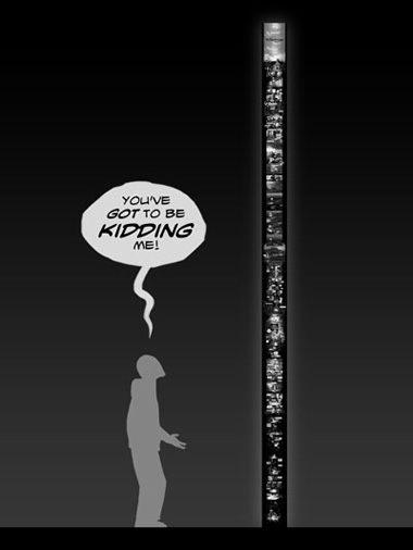
| A visualization of the size of chapter 1

| The milestone illustrations for my blog. The first milestone was reached on April 28th and the last on November 9th, 2010.